Show the code
library(here)
library(knitr)
library(tidyverse)library(here)
library(knitr)
library(tidyverse)# resolve conflicts with plotly
# conflicted::conflicts_prefer(plotly::layout)
# resolve conflicts with tidymodels packages
# tidymodels::tidymodels_prefer()library(eda4mlr)# stabilize simulated data
source(here("code", "eda4ml_set_seed.R"))This chapter introduces some basic ideas and methods in statistical sampling theory and the design of experimental or observational studies. We follow the book “Statistics, 4/e” by Freedman, Pisani, and Purves (FPP).
As our world becomes evermore connected digitally, the available data of interest may seem either to encompass the entire population of interest (e.g., online behavior of consumers), or else to be highly focused (e.g., the purchasing history of a particular customer). At these extremes the notion of a sample from a population might seem irrelevant. But sampling theory becomes relevant as soon as we transition from describing the data on hand to asking how current phenomena might change under various scenarios.
We begin with examples of observational and experimental studies, and review some sampling strategies under practical constraints.
Although these historical examples precede the current rapid development of machine learning (ML) and artificial intelligence (AI), the lessons they bear are highly relevant to the development and deployment of algorithms.
The capabilities of an ML system are bound by the quality of the data used to train, test, and evaluate it. The historical examples address the following issues.
These concerns are central to machine learning operations (MLOps), an emerging discipline that extends DevOps principles to the full model lifecycle (Mucci and Stryker 2025). MLOps emphasizes that model performance depends not only on algorithm selection, but on the entire pipeline from data acquisition through deployment and monitoring. The historical examples in this chapter illustrate how foundational issues in study design—issues that predate ML by decades—remain decisive for modern algorithmic systems.
# for instructor use only:
# record FPP page number per example
example_FPP_page <- tibble::tribble(
  ~example, ~type, ~page,
  "Lit_Digest_Poll", "obs", 334L,
  "Truman_Dewey", "obs", 337L,
  "US_elections", "obs", 342L,
  "UCB_Admissions", "obs", 17L,
  "Salk_Vaccine", "dox", 3L,
  "Portacaval_Shunt", "dox", 7L,
  "NB10", "dox", 98L
)
# save file just once
save_file <- FALSE
if (save_file) {
  example_FPP_page |> readr::write_tsv(here(
    "data", "retain", "example_FPP_page.txt"
  ))
}In 1936, President Franklin Delano Roosevelt (FDR) was completing his first term in office, and running for re-election against Alfred Landon, Governor of Kansas state. Most pundits predicted that FDR would win.
The Literary Digest magazine, however, predicted a decisive Landon victory based on a massive poll having 2.4 million respondents. The Digest predicted that Roosevelt would get only 43% of the vote.
George Gallup had just created his polling organization. Gallup took a sample of 3,000 voters to estimate what the Digest would predict, and took a sample of 50,000 voters to predict the election. Here are the results.
lit_digest_tbl <- eda4mlr::lit_digestlit_digest_tbl |> knitr::kable(
caption = "Predicted % for FDR in 1936",
col.names = c("source", "FDR predicted %")
)| source | FDR predicted % |
|---|---|
| Digest | 43 |
| Gallup re Digest | 44 |
| Gallup re election | 56 |
| election result | 62 |
As it turned out, Roosevelt won by a landslide: 62% versus 38%. The Digest’s error of nearly 20 percentage points is the largest in history by a major poll. What went wrong?
Moral: a large sample size alone does not guarantee accuracy. Ask yourself how the sample was chosen.
This is the first of several examples we will see where a failure of understanding—here, not recognizing selection bias—led directly to a failure of prediction. The Digest had data; what they lacked was comprehension of what their data could and could not represent.
The Digest poll illustrates selection bias: the sample systematically differed from the population in ways that affected the outcome of interest. In ML terms, the training data did not represent the deployment environment. A model trained on Digest respondents would have learned patterns (e.g., political preferences of car and telephone owners) that fail to generalize to the broader electorate.
Truman was a colorful and effective US president, but he was the underdog in the 1948 election. Three major polling organizations covered the election: Crossley for the Hearst newspapers, Gallup (synicated in ~100 newspapers across the country), and Roper for Fortune magazine. By the fall of 1948, all three put Dewey ahead of Truman by 5 or more percentage points. Here are the predicted and actual percentages.
truman_dewey_tbl <- eda4mlr::truman_deweytruman_dewey_tbl |> knitr::kable(
caption = "Predicted % per candidate in 1948"
)| source | Truman | Dewey | Thurmond | Wallace |
|---|---|---|---|---|
| Crossley | 45 | 50 | 2 | 3 |
| Gallup | 44 | 50 | 2 | 4 |
| Roper | 38 | 53 | 5 | 4 |
| election result | 50 | 45 | 3 | 2 |
All three polling organizations not only under-estimated the percentage vote for Truman, they were also over-confident in their predictions. Again we ask, what went wrong?
The three polling organizations used quota sampling. That is, in an effort to construct samples representative of all voters, the polling organizations ensured that sample percentages of women, men, employed, unemployed, and so on, exactly matched known population percentages.
Interviewers were given prescribed numbers of voters to interview in each category, and were otherwise unconstrained in their choice of subjects to interview.
The problem is that there are many factors that influence voting, and many of them cannot be known in advance of the election. In addition, allowing the interviewers to select their subjects (constrained only by certain demographic quotas to be fulfilled) may introduce an unwitting bias, namely toward those whom the interviewers find easier to include. As it happened, quota sampling produced a bias toward those subjects who voted Republican.1
Quota sampling attempted to match the sample to the population on observable features (gender, employment status, etc.), but missed latent factors that influenced voting. This is analogous to stratified sampling on measured covariates while ignoring unmeasured confounders. In ML practice, ensuring that training data covers the relevant feature space is necessary but not sufficient; the joint distribution of features and labels must also match deployment conditions.
Since 1948 polling organizations have adopted some form of probability sampling. The idea is that there are too many known and unknown factors that influence voting to control for them all. Therefore it is better to choose subjects at random, allowing chance to provide a sample that approximately represents the population (with better approximation for larger sample sizes).
The leading example of probability sampling is simple random sampling. Imagine a box of tickets, one ticket per registered voter. We shuffle the tickets, randomly select one to include in our sample, set that ticket aside, and then repeat this process.
When little is known about a population, simple random sampling yields more accurate estimates of a population percentage or population average than other probability samples of the same size.2 The problem is that simple random sampling is impractical in many situations. Even if polling organizations had a list (sampling frame) of all registered voters in the country, it would be prohibitively costly to interview subjects scattered across the country.
Instead, polling organizations often use multi-stage cluster sampling. As an example, from 1952 to 1984 the Gallup organization partitioned the 50 states into four regions: Northeast, South, Midwest, and West. In each region, towns are selected at random; within each town, wards are selected at random; within each ward, precincts are selected at random; and finally within each precinct, households are selected at random. Then the eligible voters present in the household (cluster) are interviewed.3 At each stage, random selection may be weighted, e.g., by population size.
Probability sampling of any type has two important features:
The hallmark of a probability sample is that the chance of including any given individual in the sample can be calculated in advance.
Since the 1952 election Gallup and other pollsters have used probability samples, and have, on the whole, reduced the magnitude of prediction error. Here are the prediction errors of the Gallup organization. (Ross Perot’s candidacy made 1992 an especially challenging year to predict.)
us_elections_48_04 <- tibble::tribble(
  ~year, ~n, ~winner, ~Gallup, ~actual, ~error,
  1952, 5385, "Eisenhower", 51, 55.1, -4.1,
  1956, 8144, "Eisenhower", 59.5, 57.4, 2.1,
  1960, 8015, "Kennedy", 51, 49.7, 1.3,
  1964, 6625, "Johnson", 64, 61.1, 2.9,
  1968, 4414, "Nixon", 43, 43.4, -0.4,
  1972, 3689, "Nixon", 62, 60.7, 1.3,
  1976, 3439, "Carter", 48, 50.1, -2.1,
  1980, 3500, "Reagan", 47, 50.7, -3.7,
  1984, 3456, "Reagan", 59, 58.8, 0.2,
  1988, 4089, "Bush", 56, 53.4, 2.6,
  1992, 2019, "Clinton", 49, 43.0, 6.0,
  1996, 2895, "Clinton", 52, 49.2, 2.8,
  2000, 3571, "Bush", 48, 47.9, 0.1,
  2004, 2014, "Bush", 49, 50.6, -1.6
) |>
  dplyr::mutate(dplyr::across(
    .cols = c(year, n),
    .fns  = as.integer
  ))

# save file just once
save_file <- FALSE
if (save_file) {
  us_elections_48_04 |>
    readr::write_tsv(here::here(
      "data", "retain", "us_elections_48_04.txt"
    ))
}us_elections_48_04 |> knitr::kable(
caption = "Gallup prediction accuracy: 1952-2004"
)| year | n | winner | Gallup | actual | error |
|---|---|---|---|---|---|
| 1952 | 5385 | Eisenhower | 51.0 | 55.1 | -4.1 |
| 1956 | 8144 | Eisenhower | 59.5 | 57.4 | 2.1 |
| 1960 | 8015 | Kennedy | 51.0 | 49.7 | 1.3 |
| 1964 | 6625 | Johnson | 64.0 | 61.1 | 2.9 |
| 1968 | 4414 | Nixon | 43.0 | 43.4 | -0.4 |
| 1972 | 3689 | Nixon | 62.0 | 60.7 | 1.3 |
| 1976 | 3439 | Carter | 48.0 | 50.1 | -2.1 |
| 1980 | 3500 | Reagan | 47.0 | 50.7 | -3.7 |
| 1984 | 3456 | Reagan | 59.0 | 58.8 | 0.2 |
| 1988 | 4089 | Bush | 56.0 | 53.4 | 2.6 |
| 1992 | 2019 | Clinton | 49.0 | 43.0 | 6.0 |
| 1996 | 2895 | Clinton | 52.0 | 49.2 | 2.8 |
| 2000 | 3571 | Bush | 48.0 | 47.9 | 0.1 |
| 2004 | 2014 | Bush | 49.0 | 50.6 | -1.6 |
In a previous session we discussed a study from the 1970s arising from a concern that admissions to graduate school at UC Berkeley might be biased against females. The study determined that the apparent bias was an instance of Simpon’s Paradox: females tended to apply to the departments having lower overall admission rates, resulting in an overall lower admission rate for females, even though most of the departments admitted a greater percentage of their female applicants than their male applicants.
In the context of sampling theory, we note that the data were limited to a single year, and included all applicants. One might ask whether the differences in admission rates were “statistically significant”, but the question presumes that the data are the result of a probability sample from a larger population, which is not the case here. The year of data (1973) was accepted as evidence that the apparent bias was an instance of Simpson’s Paradox. The concern was resolved under the assumption that the data and circumstances from that particular year were indicative of the admissions process.
Moral: the expected accuracy of statistical estimates has been established for various types of probability sampling, but if the data are not the result of a probability sample from a defined population, these established formulas are not applicable.
Polio has been a devastating, sometimes fatal, disease. The first epidemic in the US was in 1916. In the following years the disease claimed several hundreds of thousands of victims, especially children. By the 1950’s several drugs against polio were in development. The drug developed by Jonas Salk had particularly promising lab results. By 1954 the US government determined the drug should be tested in the field.
One might ask why a promising drug shouldn’t simply be adopted, rather than field-tested. One problem was that polio incidence varied considerably from year to year. In 1952 there were about 60,000 cases. The following year there were half that number. Had the vaccine been adopted in 1954, any decrease in incidence could well have been ascribed to annual variation, rather than the effectiveness of the vaccine.
The decision to test rather than adopt a promising drug is a difficult question of medical ethics. For the polio vaccine, there were potential risks in taking the drug, and so the government decided a test was needed to establish whether the benefits of adopting the drug would outweigh the risks.
The National Foundation for Infantile Paralysis (NFIP) ran a controlled experiment among children in grades 1-3, an especially vulnerable age group. The field trial was carried out in selected school districts throughout the country, where the risk of polio was high. As originally designed, the NFIP vaccinated all children in grade 2 whose parents consented to the vaccination, leaving unvaccinated those children in grade 2 whose parents did not consent. Children in grades 1 and 3 were used as the control group (were not vaccinated). The following table shows the results.
salk_blind <- eda4mlr::salk_blindsalk_nfip <- eda4mlr::salk_nfipsalk_nfip |> knitr::kable(
caption = "Polio rate per 100,000 subjects"
)| grade | assignment | size | rate |
|---|---|---|---|
| 2 | treatment | 225000 | 25 |
| 1, 3 | control | 725000 | 54 |
| 2 | no_consent | 125000 | 44 |
Participating public health experts raised several concerns with the NFIP design. Polio can be transmitted by touch, so the incidence of polio infection may vary by grade. Also, parental consent is a potential confounding factor. More highly educated parents are more likely to consent, but their children are at greater risk. (Lower socio-economic status is associated with lower hygiene, and thus a greater chance of early exposure to polio when the mother’s antibodies would be activated, enabling the child to fight off a subsequent infection.) Consequently children of non-consenting parents should not be included in the control group, but rather analyzed separately.
Consequently a second experiment was conducted in which both the treatment and control group came from the same population of children whose parents consented to vaccination. Those children would be assigned at random either to the treatment (vaccinated) or control (unvaccinated) group. Moreover, this was to be a “double-blind” experiment: the assignment of each participating child would be closely held among the administrators of the experiment, and not shared with participating parents, medical staff responsible for injections (of either the vaccine or a saline solution), or physicians determining whether a participating child had or had not contracted polio. Children whose parents did not consent to vaccination would be tracked separately from others. Here are the results of the double-blind experiment.
salk_blind |> knitr::kable(
  caption = "Double-Blind: polio rate per 100,000 subjects"
)| assignment | size | rate |
|---|---|---|
| treatment | 200000 | 28 |
| control | 200000 | 71 |
| no_consent | 350000 | 46 |
Both experments provide strong evidence of the effectiveness of the vaccine. In addition, the second experiment bears out the concern that parental consent could be a confounding factor. Among the children of consenting parents who served as controls, and thus were not vaccinated, the polio rate is markedly higher than in the NFIP experiment where controls consisted of children in grades 1 and 3, some of whose parents would not have consented to vaccination had they been asked.
Key points:
The double-blind protocol ensured that neither the subjects nor the evaluators knew treatment assignments—eliminating a source of systematic bias in the labels (polio diagnosis). In supervised ML, analogous rigor is needed in annotation protocols: annotators should not have access to information that could bias their labels. The NFIP’s initial design, where consent status was confounded with treatment, mirrors label leakage—a situation where the label-generation process is contaminated by information that would not be available at prediction time.
In some cases of cirrhosis of the liver, the patient may start to hemorrhage and bleed to death. One treatment involves surgery to redirect the flow of blood through a portacaval shunt. The operation to create the shunt is long and hazardous. Do the benefits outweigh the risks? The effectiveness of this surgery has been evaluated in 51 studies, summarized in the following table.
portacaval_tbl <- eda4mlr::portacaval_studiesportacaval_tbl |> knitr::kable(
caption = "Shunt evaluations: degree of enthusiasm per study design"
)| design | marked | moderate | none |
|---|---|---|---|
| no controls | 24 | 7 | 1 |
| controls not randomized | 10 | 3 | 2 |
| randomized controlled | 0 | 1 | 3 |
There were 32 studies without controls (first line in the table): 24/32 of these studies, or 75%, were markedly enthusiastic about the shunt, concluding that the benefits definitely outweighed the risks. In 15 studies there were controls, but assignment to treatment or control was not randomized. Only 10/15, or 67%, were markedly enthusiastic about the shunt. But the 4 studies that were randomized and controlled showed the surgery to be of little or no value. The badly designed studies exaggerated the value of this risky surgery.
A randomized, controlled experiment begins with a well-defined patient population. Some are eligible for the trial. Others are ineligible: they may be too sick to undergo the treatment, or they may have the wrong kind of disease, or they may not consent to participate. Eligibility is determined first; then the eligible patients are randomized to treatment or control. That way, the comparison is made only among patients who could have received the therapy. The bottom line: the control group is like the treatment group. By contrast, with poorly-controlled studies, ineligible patients may be used as controls. Moreover, even if controls are selected among those eligible for surgery, the surgeon may choose to operate only on the healthier patients while sicker patients are put in the control group.
This sort of bias seems to have been at work in the poorly-controlled studies of the portacaval shunt. In both the well-controlled and the poorly-controlled studies, about 60% of the surgery patients were still alive 3 years after the operation. In the randomized controlled experiments, the percentage of controls who survived the experiment by 3 years was also about 60%. But only 45% of the controls in the non-randomized experiments survived for 3 years.
shunt_survival <- eda4mlr::portacaval_survivalshunt_survival |> knitr::kable(
caption = "% patients alive after 3 years per (design, assignment)"
)| design | surgery | control |
|---|---|---|
| randomized | 60 | 60 |
| not randomized | 60 | 45 |
In both types of studies, the surgeons seem to have used similar criteria to select patients eligible for surgery. Indeed, the survival rates for the surgery group are about the same in both kinds of studies. So, what was the crucial difference? With the randomized controlled experiments, the controls were similar in general health to the surgery patients. With the poorly controlled studies, there was a tendency to exclude sicker patients from the surgery group and use them as controls. That explains the bias in favor of surgery.
The portacaval studies demonstrate how non-randomized comparisons can produce misleading results. In ML terms, this is analogous to evaluating a model on a test set that is not exchangeable with the training set—for instance, when healthier patients are systematically routed to treatment (or to training data) while sicker patients end up in controls (or the test set). The resulting performance metrics overstate the model’s true effectiveness. Randomized train/test splits, stratified appropriately, guard against this bias.
In an ideal world, the same thing measured repeatedly would yield the same result. In practice, each result is thrown off by chance error that changes from measurement to measurement. One of the earliest scientists to deal with this problem was Tycho Brahe´ (1546–1601), the Danish astronomer. But it was probably noticed first in the market place, as merchants weighed out spices and measured off lengths of silk. There are several questions about chance errors. Where do they come from? How much is likely to cancel out in the average? The first question has a short answer: in most cases, nobody knows. We’ll address the second question via an example of precision weighing done at the National Bureau of Standards (NBS), now the National Institute of Science and Technology (NIST).
First, a brief explanation of standard weights. Stores weigh merchandise on scales. The scales are checked periodically by local weights-and-measures officials, using local standard weights. The local standards too must be periodically checked against external standards, and so on. Eventually weights are calibrated against national standards. In the US that is done by NBS, now NIST.
This chain of comparisons ends at the International Prototype Kilogram (for short, The Kilogram), a platinum-iridium weight held at the International Bureau of Weights and Measures near Paris. By international treaty (The Treaty of the Meter, 1875) “one kilogram” was defined to be the weight of this object under standard conditions. All other weights are determined relative to The Kilogram. For instance, The Pound = 0.4539237 of The Kilogram.
Each country that signed the Treaty of the Meter got a national prototype kilogram, whose exact weight had been determined as accurately as possible relative to The Kilogram. These prototypes were distributed by lot, and the United States got Kilogram #20. The values of all the U.S. national standards are determined relative to K20.
In the US, accuracy in weighing at the supermarket ultimately depends on the accuracy of the calibration work by NBS/NIST. One basic issue is reproducibility: if a measurement is repeated, how much will it change? We will discuss the results for one such weight, called NB 10, whose nominal value is 10 grams (about the weight of two nickels). In fact, the people who manufactured NB 10 tried to make it weigh 10 grams and missed by a little. NB 10 was acquired by NBS around 1940, and they’ve weighed it many times since then. We’ll look at 100 of these measurements, which were made in the same room, on the same apparatus, by the same technicians. Every effort was made to follow the same procedure each time. All the factors known to affect the results, like air pressure or temperature, were kept as constant as possible.
Here are the first 5 measurements of NB10 in grams, along with the deficit (shortfall) from 10 grams expressed in micrograms.
NB10_first_5 <- tibble::tibble(
  measurement = c(9.999591, 9.999600, 9.999594, 9.999601, 9.999598)
) |>
  dplyr::mutate(
    deficit = as.integer(1e7 - (measurement * 1e6))
  )

# save file just once
save_file <- FALSE
if (save_file) {
  NB10_first_5 |> readr::write_tsv(here(
    "data", "retain", "NB10_first_5.txt"
  ))
}NB10_first_5 |> knitr::kable(
caption = "NB10: measurement (grams) and deficit (micrograms)"
)| measurement | deficit |
|---|---|
| 9.999591 | 409 |
| 9.999600 | 400 |
| 9.999594 | 406 |
| 9.999601 | 399 |
| 9.999598 | 402 |
Here are all 100 measurements expressed as deficits in micrograms.
NB10_wide <- tibble::tribble(
  ~idx_1, ~d_1, ~idx_2, ~d_2, ~idx_3, ~d_3, ~idx_4, ~d_4,
  1, 409, 26, 397, 51, 404, 76, 404,
  2, 400, 27, 407, 52, 406, 77, 401,
  3, 406, 28, 401, 53, 407, 78, 404,
  4, 399, 29, 399, 54, 405, 79, 408,
  5, 402, 30, 401, 55, 411, 80, 406,
  6, 406, 31, 403, 56, 410, 81, 408,
  7, 401, 32, 400, 57, 410, 82, 406,
  8, 403, 33, 410, 58, 410, 83, 401,
  9, 401, 34, 401, 59, 401, 84, 412,
 10, 403, 35, 407, 60, 402, 85, 393,
 11, 398, 36, 423, 61, 404, 86, 437,
 12, 403, 37, 406, 62, 405, 87, 418,
 13, 407, 38, 406, 63, 392, 88, 415,
 14, 402, 39, 402, 64, 407, 89, 404,
 15, 401, 40, 405, 65, 406, 90, 401,
 16, 399, 41, 405, 66, 404, 91, 401,
 17, 400, 42, 409, 67, 403, 92, 407,
 18, 401, 43, 399, 68, 408, 93, 412,
 19, 405, 44, 402, 69, 404, 94, 375,
 20, 402, 45, 407, 70, 407, 95, 409,
 21, 408, 46, 406, 71, 412, 96, 406,
 22, 399, 47, 413, 72, 406, 97, 398,
 23, 399, 48, 409, 73, 409, 98, 406,
 24, 402, 49, 404, 74, 400, 99, 403,
 25, 399, 50, 402, 75, 408, 100, 404
) |>
  dplyr::mutate(dplyr::across(
    .cols = everything(),
    .fns  = as.integer
))NB10_long <- eda4mlr::nb10NB10_wide |> knitr::kable(
caption = "NB10 (index, deficit)",
col.names = rep(c("index", "deficit"), 4)
)| index | deficit | index | deficit | index | deficit | index | deficit |
|---|---|---|---|---|---|---|---|
| 1 | 409 | 26 | 397 | 51 | 404 | 76 | 404 |
| 2 | 400 | 27 | 407 | 52 | 406 | 77 | 401 |
| 3 | 406 | 28 | 401 | 53 | 407 | 78 | 404 |
| 4 | 399 | 29 | 399 | 54 | 405 | 79 | 408 |
| 5 | 402 | 30 | 401 | 55 | 411 | 80 | 406 |
| 6 | 406 | 31 | 403 | 56 | 410 | 81 | 408 |
| 7 | 401 | 32 | 400 | 57 | 410 | 82 | 406 |
| 8 | 403 | 33 | 410 | 58 | 410 | 83 | 401 |
| 9 | 401 | 34 | 401 | 59 | 401 | 84 | 412 |
| 10 | 403 | 35 | 407 | 60 | 402 | 85 | 393 |
| 11 | 398 | 36 | 423 | 61 | 404 | 86 | 437 |
| 12 | 403 | 37 | 406 | 62 | 405 | 87 | 418 |
| 13 | 407 | 38 | 406 | 63 | 392 | 88 | 415 |
| 14 | 402 | 39 | 402 | 64 | 407 | 89 | 404 |
| 15 | 401 | 40 | 405 | 65 | 406 | 90 | 401 |
| 16 | 399 | 41 | 405 | 66 | 404 | 91 | 401 |
| 17 | 400 | 42 | 409 | 67 | 403 | 92 | 407 |
| 18 | 401 | 43 | 399 | 68 | 408 | 93 | 412 |
| 19 | 405 | 44 | 402 | 69 | 404 | 94 | 375 |
| 20 | 402 | 45 | 407 | 70 | 407 | 95 | 409 |
| 21 | 408 | 46 | 406 | 71 | 412 | 96 | 406 |
| 22 | 399 | 47 | 413 | 72 | 406 | 97 | 398 |
| 23 | 399 | 48 | 409 | 73 | 409 | 98 | 406 |
| 24 | 402 | 49 | 404 | 74 | 400 | 99 | 403 |
| 25 | 399 | 50 | 402 | 75 | 408 | 100 | 404 |
Here is the distribution of the NB10 deficits expressed as a histogram.
g_NB10 <- NB10_long |>
  ggplot2::ggplot(mapping = ggplot2::aes(x = deficit)) +
  ggplot2::geom_histogram(fill = "coral") +
  ggplot2::labs(
    title = "NB10: micrograms below 10 grams"
  )
g_NB10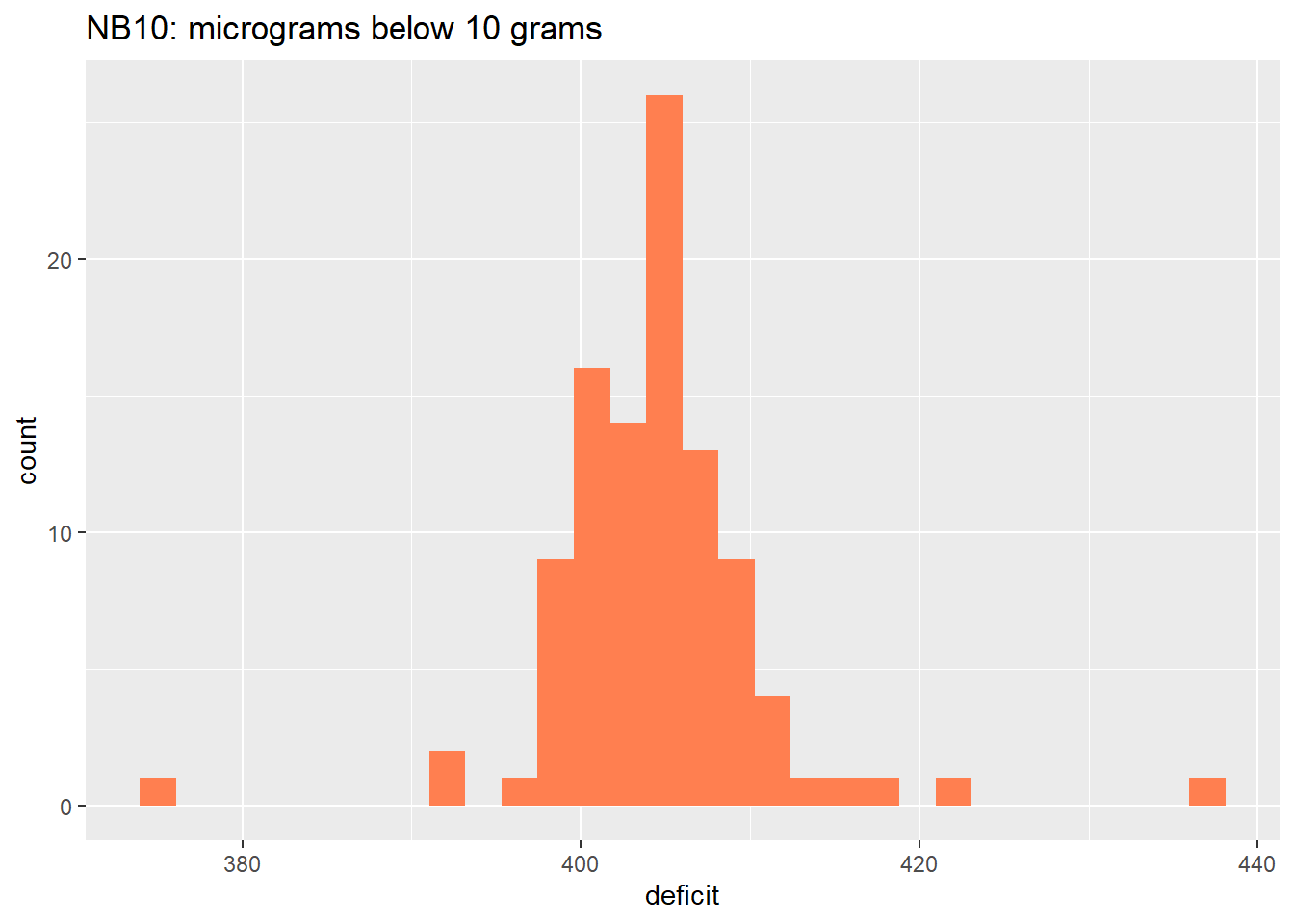
NB10_stats <- NB10_long |>
  dplyr::summarise(
    avg = mean(deficit, na.rm = TRUE),
    sd  = sd(deficit, na.rm = TRUE)
  )
The average deficit is 405 micrograms, and the standard deviation is about 6.5 micrograms.
The next figure shows the deficits expressed in standard units. The histogram has been smoothed into an approximate density function, with a standard normal curve superimposed.
NB10_z_score <- NB10_long |>
  dplyr::mutate(
    z_score = (deficit - NB10_stats$avg)/NB10_stats$sd
)NB10_normal_approx <- tibble::tibble(
z = seq(
from = min(NB10_z_score$z_score, na.rm = TRUE),
to = max(NB10_z_score$z_score, na.rm = TRUE),
length.out = 1000
),
d = dnorm(z)
)g_NB10_z_score <- NB10_z_score |>
ggplot2::ggplot(mapping = ggplot2::aes(x = z_score)) +
ggplot2::stat_density(geom = "area", outline.type = "both") +
ggplot2::geom_histogram(fill = "blue", stat = "density") +
ggplot2::labs(
title = "NB10: z-scores and standard normal curve"
) +
ggplot2::geom_line(
data = NB10_normal_approx,
mapping = ggplot2::aes(
x = z, y = d,
colour = "red"
),
show.legend = FALSE
)
g_NB10_z_score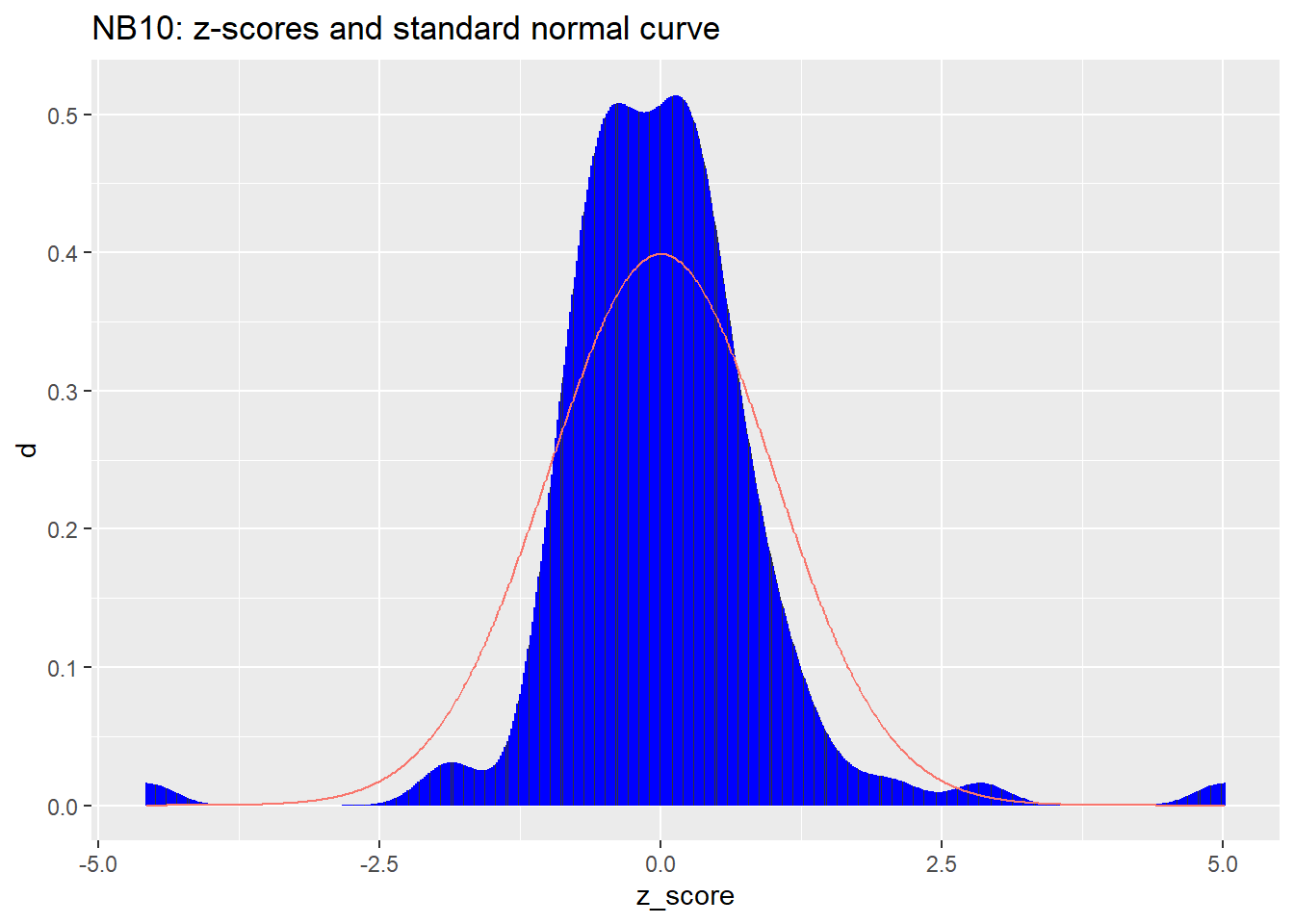
The first of the two figures above shows that the average deficit of NB10 is around 405 micrograms. Thus the actual weight of NB10 is likely to be about 10 grams minus 405 micrograms. Knowing this, one could calibrate other weights against NB10, adjusting for the fact that NB10 weighs this much less than the nominal 10 grams. Without such knowledge, taking NB10 at face value as weighing 10 grams would amount to a biased measurement system.
The second of the two figures above reveals measurements whose standard units (z-scores) are near \(\pm 5\). (The indices of the outlying measurements are #86 and #94.) NBS could find no reason to disqualify these values. Now, a sample of size 100 from a normal distribution would be highly unlikely to include such large deviations from the average value. We conclude that this very carefully controlled measurement process produces values that do not follow the normal distribution.
Key points:
The NB10 measurements illustrate two issues that carry directly into ML:
Systematic bias: The weight’s true value differs from its nominal value by a consistent amount (~405 µg). In ML, analogous biases arise when labels are systematically shifted from ground truth—for example, when human annotators consistently over- or under-estimate a quantity.
Non-normal errors: Even under highly controlled conditions, the error distribution has heavier tails than the normal distribution (outliers at indices #86 and #94). ML systems trained on data with such outliers may be unduly influenced by them unless robust methods are employed.
These measurement-level concerns propagate through any downstream model. EDA’s role is to detect such issues before they compromise model training.
The last example showed that NB10, nominally weighing 10 grams, actually weighs a bit less, namely, about 405 micrograms less than 10 grams. Of course a new batch of measurements of NB10 might yield an average deficit differing a bit from 405 micrograms. Just how different might that new average be? Here is a quick review of the mathematical answer to that question.
We model a sequence of measured deficits
\[ \begin{align} D_{\bullet} &= (D_1, \ldots, D_n) \end{align} \qquad(5.1)\]
as independent, identically distributed random variables (whose common distribution is something like the histogram shown above). Each measured deficit \(D_j\) is represented as the sum of \(\mu_d\), the actual (but unknown) deficit, plus \(\epsilon_j\), a chance error.
\[ \begin{align} D_j &= \mu_D + \epsilon_j \end{align} \qquad(5.2)\]
We assume the population distribution of the chance errors has the same shape and scale as that of measured deficits, but with a population mean value of zero. Thus the chance errors have the same population standard deviation, \(\sigma_D\), as the measured deficits. Based on the 100 NB10 measurements this unknown value is not too far from 6.5 micrograms.
Then \(S(D_{\bullet})\), the sum of \(n\) measured deficits, has the following expected value (population mean) and population variance.
\[ \begin{align} S(D_{\bullet}) &= \sum_{j = 1}^n D_j \\ &= \sum_{j = 1}^n ( \mu_D + \epsilon_j ) \\ &= n \; \mu_D \; + \; \sum_{j = 1}^n \epsilon_j \\ \\ E \left\{ S(D_{\bullet}) \right\} &= n \; \mu_D \\ \\ Var \left\{ S(D_{\bullet}) \right\} &= n \; Var \left\{ \epsilon_j \right\} \\ &= n \; \sigma_D^2 \\ \end{align} \qquad(5.3)\]
Denoting the sample average as \(A(\cdot)\), we have
\[ \begin{align} A(D_{\bullet}) &= \frac{1}{n} S(D_{\bullet}) \\ &= \mu_D \; + \; A(\epsilon_{\bullet}) \\ \\ E \left\{ A(D_{\bullet}) \right\} &= \mu_D \\ \\ Var \left\{ A(D_{\bullet}) \right\} &= \frac{1}{n^2} Var \left\{ S(D_{\bullet}) \right\} \\ &= \frac{1}{n^2} \; n \; \sigma_D^2 \\ &= \frac{1}{n} \; \sigma_D^2 \\ \\ SD \left\{ A(D_{\bullet}) \right\} &= \sqrt{Var \left\{ A(D_{\bullet}) \right\}} \\ &= \frac{1}{\sqrt{n}} \; \sigma_D \\ \end{align} \qquad(5.4)\]
Thus the population standard deviation of the sample average \(A(D_{\bullet})\) can be estimated from the sample standard deviation:
\[ \begin{align} \hat{SD} \left\{ A(D_{\bullet}) \right\} &= \frac{1}{\sqrt{n}} \; \hat{\sigma}_D \\ \end{align} \qquad(5.5)\]
Returning to our sample of 100 NB10 measurements, with a sample average of about 405 micrograms and a sample standard deviation of about 6.5 micrograms, we have
\[ \begin{align} \hat{SD} \left\{ A(D_{\bullet}) \right\} &= \frac{1}{\sqrt{100}} \; 6.5 \\ &= 0.65 \end{align} \qquad(5.6)\]
Our sample average of 405 micrograms probably deviates from the actual deficit of NB10 by no more 2 micrograms or so.
The examples above involve problems with data collection: selection bias in the Literary Digest poll, confounding in the observational studies, measurement error in the NB10 weights. But even when data are sound, analytical choices can lead to divergent conclusions.
A striking demonstration of this comes from Silberzahn et al. (2018), who recruited 29 independent research teams to answer the same question using the same dataset: Are soccer referees more likely to give red cards to dark-skinned players than to light-skinned players?
The results were sobering. Teams used 21 distinct combinations of covariates. Estimated effect sizes ranged from 0.89 to 2.93 (in odds-ratio terms), with some teams finding a statistically significant effect and others finding none. All teams were competent. All had access to identical data. Yet they reached materially different conclusions.
What explains this divergence? Each team made defensible choices about data cleaning, variable selection, model specification, and statistical framework. These choices—what Holmes (2018) calls the “flexibility” available to modern analysts—compound multiplicatively. An analyst who considers two options at each of five decision points faces \(2^5 = 32\) possible analytical paths. In high-dimensional settings, the combinatorics become staggering.
Holmes illustrates the danger with a simple example from immunology. Suppose an ELISA 4 test produces a positive result for 4 of 50 patients at a particular protein site. Under the null hypothesis (no true effect), observing four or more positives has probability 0.00175—seemingly strong evidence. But if the researcher actually tested 60 candidate sites and reported only the most promising one, the probability of observing a maximum this extreme rises to approximately 0.10. The same data, viewed honestly, no longer supports rejection of the null. This is not fraud; it is the natural consequence of selecting results after examining the data.
The problem intensifies when visualization enters the workflow. Holmes warns of “Pareidolia”—the human tendency to perceive meaningful patterns in random configurations. The same cognitive capacity that makes us excellent at exploratory pattern detection makes us vulnerable to over-interpreting noise, particularly when we have flexibility in choosing which patterns to highlight.
Gelman and Loken (2014) use the evocative phrase “garden of forking paths” to describe how analysts navigate decision trees during data analysis. Even without conscious p-hacking, the paths not taken remain invisible in the final report, making the reported results appear more conclusive than they are.
What the Silberzahn study reveals empirically and the Holmes paper elaborates theoretically is that translating a real-world question into a technical formulation admits many defensible specifications. The question “are dark-skinned players penalized more often?” can be operationalized through different measures of skin tone, different sets of covariates, different model families, and different inferential frameworks. Each choice is a branching point; each branch leads to potentially different conclusions.
This is precisely where exploratory data analysis finds its proper role—and its proper limits. EDA is the appropriate setting for examining data structure, identifying anomalies, generating hypotheses, and discovering which analytical choices might matter. But EDA should not be confused with confirmatory analysis. As Holmes (2018) emphasizes, a “clear division between exploratory and confirmatory stages” is essential. The exploratory phase generates candidate models and hypotheses; the confirmatory phase tests them on held-out data or through pre-registered protocols.
The machine learning practice of partitioning data into training, validation, and test sets institutionalizes this separation. The training set supports exploration and model fitting. The validation set guides hyperparameter tuning and model selection. The test set—touched only once, at the end—provides an honest estimate of generalization performance. This discipline exists precisely because the flexibility to optimize on visible data inflates apparent performance.
The analyst degrees of freedom documented by Silberzahn et al. (2018) appear throughout ML pipelines:
Two practitioners with the same training data may build models with meaningfully different performance characteristics based on these choices. The “best” model depends on decisions the analyst makes—decisions that are rarely uniquely determined by the data.
The Silberzahn study does not counsel despair. It counsels humility and transparency. From personal experience navigating analytical choices, three practices have proven particularly valuable.
Transparency. We’ve learned to document not just what we did but what alternatives we considered. When revisiting old work—or when colleagues review it—understanding the path through the garden of forking paths matters as much as the destination. Recording decision points makes it possible for readers to assess robustness and for future analysts (including my future self) to understand why certain choices were made.
Sensitivity analysis. When conclusions depend on contestable choices, we find it worthwhile to examine how results change under alternative specifications. Stability across reasonable alternatives strengthens confidence; instability signals that conclusions are provisional and deserve appropriately tentative language.
Communication. Over time, we’ve come to appreciate the importance of reporting uncertainty honestly. A finding that holds under one defensible specification but not others warrants different language than one that proves robust across multiple approaches. For confirmatory work, pre-registering the analytical plan before seeing results disciplines the process and helps distinguish exploratory from confirmatory findings.
None of this diminishes the value of exploratory work. Discovery requires exploration. But discovery claims require confirmation—ideally on independent data, or at minimum through transparent acknowledgment of the analytical flexibility involved.
The Literary Digest failed because of data problems. The Silberzahn study shows that even with good data, analytical choices matter. Both lessons inform responsible practice.
Exploratory data analysis occupies a critical position between study design and model development. The study design determines what data could be collected and how representative it should be; EDA reveals what was actually collected and whether the design intentions were achieved.
For ML practitioners, EDA answers questions such as:
The examples in this chapter—from the Literary Digest poll to the NB10 measurements—show that study design flaws are often invisible until the data are examined. No algorithm can overcome a fundamentally flawed data collection process; EDA is the diagnostic step that reveals whether the data support the intended use of the model.
(Observational Studies in Practice) Break into teams to identify examples of (or opportunities for) observational studies in the context of work. Which of these would you regard as most valuable? Based on the examples in this chapter, or your experience, what are the potential pitfalls of such studies?
A teaching assistant gives a quiz to his section. There are 10 questions on the quiz and no part credit is given. After grading the papers, the TA writes down for each student the number of questions the student got right and the number wrong. The average number of right answers is 6.4 with an SD of 2.0. The average number of wrong answers is [?] with an SD of [?]. Fill in the blanks, or do you need the data? Explain briefly.
A large, representative sample of Americans was studied by the Public Health Service, in the Health and Nutrition Examination Survey (HANES2). The percentage of respondents who were left-handed decreased steadily with age, from 10% at 20 years to 4% at 70. “The data show that many people change from left-handed to right-handed as they get older.” True or false? Why? If false, how do you explain the pattern in the data?
For a certain group of women, the 25th percentile of height is 62.2 inches and the 75th percentile is 65.8 inches. The histogram follows the normal curve. Find the 90th percentile of the height distribution.
“Statistics, 4/e” by Freedman, Pisani, and Purves (FPP)
Sampling Techniques, 3/e by William G. Cochran
Gallup and others used quota sampling in pre-election surveys from 1936 though 1948. Interviewers consistently chose a disproportionate number of people who wound up voting Republican, but until 1948, a close election, the Democratic lead was larger than this oversampling of Republicans.↩︎
On the other hand, if a percentage or average is known to vary across identifiable subsets (strata) of the population, then stratified sampling can yield more accurate estimates than simple random sampling.↩︎
Each interviewer is given a prescribed protocol for selecting an eligible voter within the household (e.g., oldest eligible female, if present, or else youngest eligible male), with these prescriptions possibly varying among interviewers.↩︎